OLAP Data Cube - Chart a Dimension
You can view data from an OLAP cube as a chart by clicking the small chart icon next to any measure.
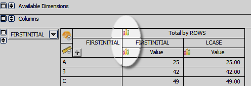
OLAP charts are similar to other Argos charts, and can be customized to display the dimensions and measures that you want to view.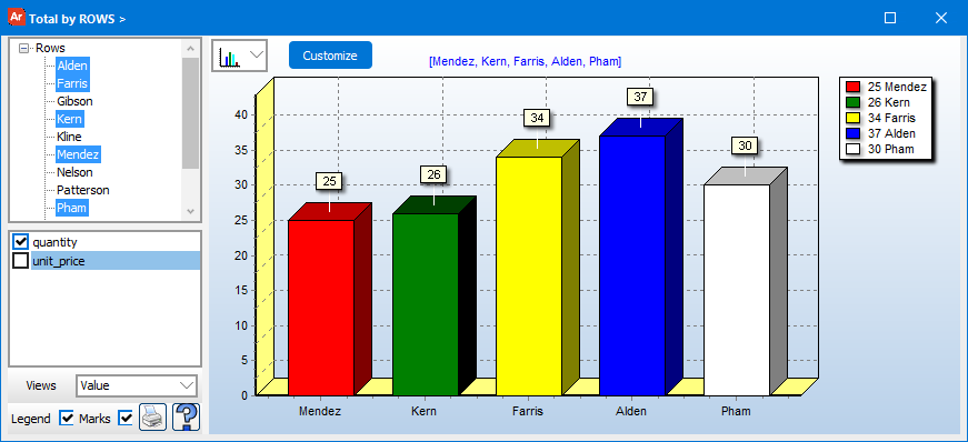
Chart Options
| Option | Description |
|---|---|
| Dimension Values | Expand the dimension by clicking on the arrow. A list of all values for this particular dimension appears, allowing you to select which values should be included in the chart. Hold down the Control key to select more than one value. |
| Legend checkbox | Show or hide the legend for this chart. |
| Marks | Show or hide the value labels for each data point. |
| Print the current chart. | |
| Chart Type drop down | Select the type of chart from the drop down box. |
| Customize | If you would like to customize your chart further, click this button to bring up the Advanced Chart Editor. |
Need More Help?
If you need additional help creating OLAP Cubes, refer to Getting Started with OLAP Cubes.